Moon charts, a pie chart alternative for two groups in ggplot2

gggibbous can be installed from CRAN:
install.packages("gggibbous")The development version can be installed from GitHub with the
devtools package:
devtools::install_github("mnbram/gggibbous")A pie chart divides a circle into multiple sections where the arc lengths (and so also the areas) of the sections represent proportions of a whole. A moon chart, similarly, divides a circle into sections where the areas represent proportions of a whole, but in a moon chart the areas are drawn as crescent or gibbous portions of a circle—like the phases of the moon.

The motivation behind using a moon chart instead of a pie chart is primarily one of aesthetic choice. Note also that because the sections of a moon chart are swept from one or the other side of the circle, they are generally only appropriate for depicting one or two groups.
Moon charts are similar to Kosara’s (2019)[1] “circular slice” chart. In studying subjects’ perception of percentages in different chart types, the “circular slice” performed similarly to pie charts. Moon charts differ from the “circular slice” in that the latter slides a second disc of the same size over a base circle, more like a lunar eclipse than the sphases of the moon. Both depend on area as the perceptual cue, however.
gggibbous and its
usagegggibbous extends the ggplot2 data
visualization package to provide support for moon charts in R. Unlike
the pie charts supported natively by coord_polar() in R,
moon charts in gggibbous do not require any special
coordinate system. They are drawn most similarly to points in
ggplot2: their position is defined by an x and
a y coordinate and their size is defined independently of
the coordinate system, so they always remain circular.
library(gggibbous)
#> Loading required package: ggplot2ggplot(data.frame(x = 1:5, y = 1, size = 2^(0:4)), aes(x, y, size = size)) +
geom_moon() +
geom_point(y = 2) +
lims(x = c(0.5, 5.5), y = c(0.5, 2.5)) +
scale_size(range = c(5, 10))
Two new aesthetics are also important in geom_moon:
ratio and right.
ratio aestheticratio controls the proportion of the moon to be drawn.
It must be between 0 (a “new moon” where nothing is actually drawn) and
1 (a “full moon”, i.e. a circle).
ggplot(data.frame(x = 1:5, y = 0, ratio = 0:4 * 0.25), aes(x = x, y = y)) +
  geom_moon(aes(ratio = ratio), size = 20, fill = "black") +
  geom_text(aes(y = y + 1, label = ratio)) +
  lims(x = c(0.5, 5.5), y = c(-1, 1.4)) +
  theme_void()
right aestheticright takes a boolean value that controls whether the
moon is “waxing” or “waning”—that is, whether it is “filled” from the
right or the left.
One way to make a “complete” moon with two colors is to use
right = TRUE for one color and right = FALSE
for the other, with complementary ratios. (See the examples below for
some other approaches.)
tidymoons <- data.frame(
  x = rep(1:3, 6),
  y = rep(rep(3:1, each = 3), 2),
  ratio = c(1:9 / 10, 9:1 / 10),
  right = rep(c(TRUE, FALSE), each = 9)
)

ggplot(tidymoons) +
  geom_moon(aes(x, y, ratio = ratio, right = right, fill = right)) +
  lims(x = c(0.5, 3.5), y = c(0.5, 3.5))
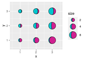
gggibbous includes three key glyphs for different types
of legends: draw_key_moon, draw_key_moon_left,
and draw_key_full_moon
draw_key_moon—the default in
geom_moon—draws a gibbous moon with
right = TRUE (see above).
draw_key_moon_left draws a crescent
moon from the left that is complementary to the gibbous moon in
draw_key_moon, which is useful for combined legends:
ggplot(tidymoons, aes(x, y, ratio = ratio, right = right, size = 2^x)) +
  geom_moon(data = subset(tidymoons, right), fill = "violetred") +
  geom_moon(
    data = subset(tidymoons, !right), fill = "turquoise3",
    key_glyph = draw_key_moon_left
  ) +
  lims(x = c(0.5, 3.5), y = c(0.5, 3.5)) +
  scale_size("size", range = c(5, 10), breaks = 2^(1:3))
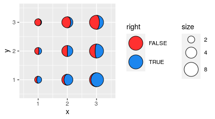
draw_key_full_moon draws a circle. It
is similar to the “point” key glyph, but the size is calculated slightly
differently, so it is more appropriate if you want the size of legend
moons and the size of the plot moons to match.
ggplot(tidymoons) +
  geom_moon(
    aes(x, y, ratio = ratio, right = right, fill = right, size = 2^x),
    key_glyph = draw_key_full_moon
  ) +
  lims(x = c(0.5, 3.5), y = c(0.5, 3.5)) +
  scale_size("size", range = c(5, 10), breaks = 2^(1:3)) +
  scale_fill_manual(values = c("firebrick1", "dodgerblue2")) +
  theme(legend.box = "horizontal")
One common use of multiple pie charts is to represent proportions at different coordinates on a map. The x and y dimensions are already committed to the map coordinates, so proportional visualizations like bar charts are more difficult. This is a perfect opportunity to try out moon charts!
Pie chart maps are popular in population genetics, so let’s look at
an example from that field. The dmeladh data[2] contains
frequencies of two variants of the Adh gene in Australian and
Papua New Guinean fruit fly populations. Many of these populations are
close together, so we have to deal with overplotting, which we do
manually below.
dmeladh_adj <- dmeladh
dmeladh_adj$long <- dmeladh$Longitude + c(
  -2, 0, -2, 2, -3, 3, 3, 2, 3, 4, -2.5, -2.5, -1, -2, -2.5, -4, 2.5,
  5, 6, 7, 2, -7, -5.5, -3, 0, -7, -2, 3, 5.5, 0.5, -1, -1.5, -3, 2)
dmeladh_adj$lat <- dmeladh$Latitude + c(
  -2, 2, 0, 1, 0, 0, 0, 2, 0.5, -1, 1, -1.5, 2, 4, 1.5, 0, 2,
  1, -1, -3, -2, 1, -1, -2, -3, -2, -4, -3, -1, 1.5, 2, 2, -2, 0)

moonmap <- ggplot(dmeladh_adj, aes(long, lat)) +
  geom_polygon(
    data = map_data(
      "world", region = "(Australia)|(Indonesia)|(Papua New Guinea)"),
    aes(group = group),
    fill = "gray80"
  ) +
  geom_segment(aes(xend = Longitude, yend = Latitude), color = "gray20") +
  geom_point(aes(Longitude, Latitude), size = 0.75, color = "gray20") +
  scale_size(range = c(4, 10)) +
  coord_map(xlim = c(110, 160), ylim = c(-45, -5)) +
  theme_void() +
  theme(
    legend.position = c(0.05, 0.05),
    legend.direction = "horizontal",
    legend.justification = c(0, 0)
  )

moonmap +
  geom_moon(
    aes(ratio = AdhS / 100, size = N),
    right = FALSE, fill = "gold", color = "gold",
    key_glyph = draw_key_moon_left
  ) +
  geom_moon(
    aes(ratio = AdhF / 100, size = N),
    fill = "forestgreen", color = "forestgreen"
  )
If we want to label the alleles in the legend explicitly, then we need to map them to a group, which requires that we rearrange the data into a “longer” (“tidy”) format.
tidyadh <- reshape(
  dmeladh_adj,
  varying = c("AdhF", "AdhS"),
  v.names = "percent",
  timevar = "allele",
  times = c("AdhF", "AdhS"),
  idvar = c("Locality", "Latitude", "Longitude", "long", "lat", "N"),
  direction = "long"
)
tidyadh$right <- rep(c(TRUE, FALSE), each = nrow(dmeladh_adj))

moonmap +
  geom_moon(
    data = tidyadh, key_glyph = draw_key_full_moon,
    aes(ratio = percent / 100, fill = allele, color = allele, right = right,
        size = N)
  ) +
  scale_fill_manual(values = c("forestgreen", "gold")) +
  scale_color_manual(values = c("forestgreen", "gold"))
Sometimes you just want to plot literal representations of the moon.
The lunardist data, adapted from NASA, contains the
distance from the Earth to the Moon for each day in 2019, as well as the
dates (in UTC) of each occurrence of the four principal phases of the
moon. We can plot those principal phases using moon charts (which in
this case are identical to pie charts).
moonphase <- subset(lunardist, !is.na(phase))
moonphase$percent <- ifelse(
  moonphase$phase == "new", 0, ifelse(moonphase$phase == "full", 1, 0.5))

ggplot(lunardist, aes(date, distance)) +
  geom_line() +
  # Plotting the lower layer as a full circle also works in most cases
  geom_moon(data = moonphase, ratio = 1, size = 5, fill = "black") +
  geom_moon(
    data = moonphase, aes(ratio = percent),
    size = 5, fill = "yellow", right = moonphase$phase == "first quarter"
  )
“Harvey balls” are essentially pie charts used for qualitative comparisons, often in tabular format. We can use moon charts for the same purpose.
First, let’s make up some data:
rest_names <- c(
  "Anscombe's Luncheonette", "Chai Squared", "Tukey's Honest Southern Diner",
  "Bagels ANOVA", "Spearmint Row"
)
restaurants <- data.frame(
  Restaurant = factor(rest_names, levels = rest_names),
  Food = c(5, 3, 4, 4, 1),
  Decor = c(2, 5, 3, 1, 5),
  Service = c(4, 2, 3, 3, 5),
  Price = c(4, 5, 2, 5, 2)
)
As a regular table:
| Restaurant | Food | Decor | Service | Price |
|---|---|---|---|---|
| Anscombe’s Luncheonette | 5 | 2 | 4 | 4 |
| Chai Squared | 3 | 5 | 2 | 5 |
| Tukey’s Honest Southern Diner | 4 | 3 | 3 | 2 |
| Bagels ANOVA | 4 | 1 | 3 | 5 |
| Spearmint Row | 1 | 5 | 5 | 2 |
And now as a table with Harvey moons:
# First we reshape the data into "long" format to facilitate plotting
rest_cats <- c("Food", "Decor", "Service", "Price")
tidyrest <- reshape(
  restaurants,
  varying = rest_cats,
  v.names = "Score",
  timevar = "Category",
  times = factor(rest_cats, levels = rest_cats),
  idvar = "Restaurant",
  direction = "long"
)

ggplot(tidyrest, aes(0, 0)) +
  geom_moon(aes(ratio = (Score - 1) / 4), fill = "black") +
  geom_moon(aes(ratio = 1 - (Score - 1) / 4), right = FALSE) +
  facet_grid(Restaurant ~ Category, switch = "y") +
  theme_minimal() +
  theme(
    panel.grid = element_blank(),
    strip.text.y.left = element_text(angle = 0, hjust = 1),
    axis.text = element_blank(),
    axis.title = element_blank()
  )
Kosara, R. 2019. Circular Part-to-Whole Charts Using the Area Visual Cue. EuroVis 2019 - Short Papers. https://doi.org/10.2312/evs.20191163
Oakeshott, J.G., et al. 1982. Alcohol dehydrogenase and glycerol-3-phosphate dehydrogenase clines in Drosophila melanogaster on different continents. Evolution, 36(1): 86-96.