
The parallel coordinates approach is a popular method for graphing multivariate data. However, for large data sets, the method suffers from a “black screen problem” – the jumble of lines fills the screen and it is difficult if not impossible to discern any relationships in the data.
Consider the package dataset mlb, consisting of data on Major League Baseball players, courtesy of the UCLA Stat Dept.
data(mlb)
# extract height, weight, age
m <- mlb[,4:6]
# ordinary parallel coordinates
library(MASS)
parcoord(m) 
Each polygonal line in the graph represents one player, connecting his height, weight and age. If a player had his (height,weight,age) tuple as, say (73,192,25), his line would have height 73 on the Height axis, height 192 on the Weight axis and height 25 on the Age axis. But since there are so many lines (actually only about 1000), the graph is useless.
Our solution is to graph only the most frequent lines. Our freqparcoord package does this for continuous variables, with line frequency defined in terms of estimated multivariate density. The current package, cdparcoord, covers the case of categorical variables, with frequency defined as actual tuple count. (In a mixed continuous-categorical setting, the continuous variables are discretized.)
install.packages("cdparcoord")install.packages("devtools")
devtools::install_github("matloff/cdparcoord")Here we give a quick view of the package operations. It is assumed that the user has already executed
library(cdparcoord)This example involves data from the 2000 U.S. census on programmers and engineers in Silicon Valley, a dataset included with the package.
Suppose our interest is exploring whether women encounter wage discrimination. Of course we won’t settle such a complex question here, but it will serve as a good example of the use of the package as an exploratory tool.
We first load the data, and select some of the columns for display. (In this tutorial, the terms column and variable will be used interchangeably, and will have the same meaning as feature.) We also remove some very high wages (at least in the context of the year 2000) to make the display easier.
data(prgeng)
pe <- prgeng[,c(1,3,5,7:9)]
pe25 <- pe[pe$wageinc < 250000,]
The resulting data has just under 20,000 rows.
As mentioned, a key feature of the package is discretization of continuous variables, so that the tuple frequency counts will have meaning. We will do this via the package’s discretize() function, which we will apply to the numeric variables.
However, in this particular data set, there are variables that seem numeric but are in essence factors, as they are codes. For the educ variable, for instance, the number 14 codes a master’s degree. (A code list is available at the Census Bureau site.)
So, let’s change the coded variables to factors, and then discretize:
pe25 <- makeFactor(pe25,c('educ','occ','sex'))
pe25disc <- discretize(pe25,nlevels=5)
Each of the numeric variables here is discretized into 5 levels.
Now display:
discparcoord(pe25disc,k=150,saveCounts=FALSE) Here we are having cdparcoord display the 150 most frequent tuple patterns. The result is
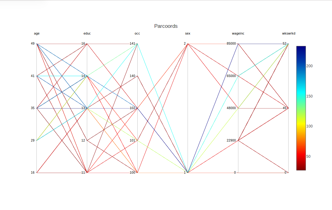
For example, there is a blue line corresponding to the tuple,
(age=35,educ=14,occ=102,sex=1,wageinc=100000,wkswrkd=52)
The frequencies are color-coded according to the legend at the right. So the above tuple occurred something like 60 times in the data.
What about the difference between males and females (coded 1 and 2)? One interesting point is that there seems to be greater range in the men’s salaries. At the high end, though, men seem to have the edge.
Now, can that edge may be explained by differences between the two groups in other variables? For instance, do women tend to be in lower-paying occupations? To investigate that, let’s move the occ column to be adjacent to wageinc.
This is accomplished by a mouse operation that is provided by plotly, the graphical package on top of which cdparcoord is built. Specifically, we can use the mouse to drag the occ label to the right, releasing the mouse when the column reaches near the wageinc column. The result is
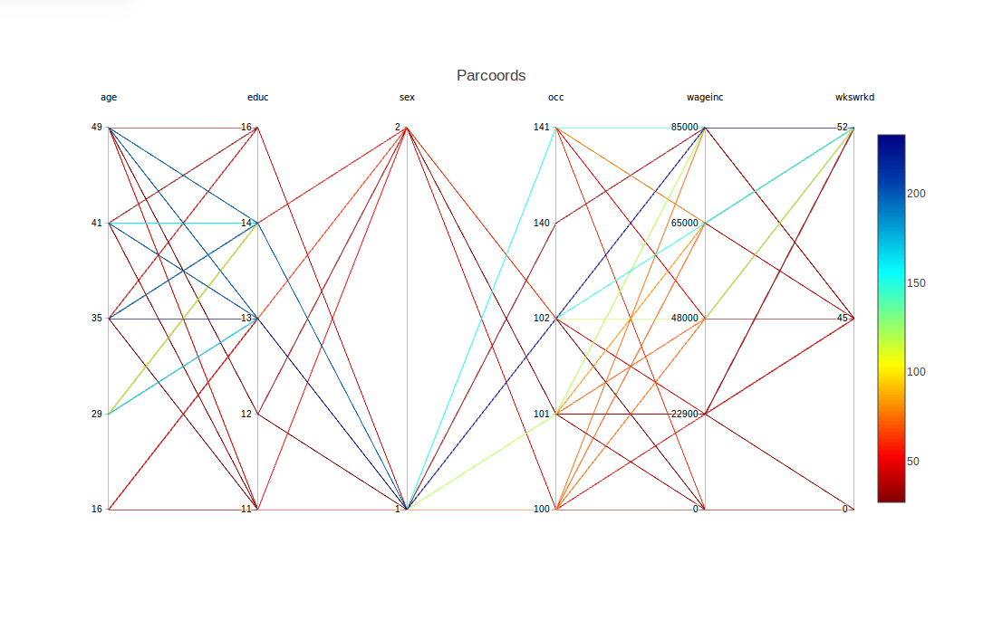
As noted, there is a range for each occupation. However, looking at the more-frequent lines, occupation 102 seems to rather lucrative (and possibly 140 and 141). And if so, that seems to be bad news for the women, as occupation 102 seems more populated by men. On the other hand, this might help explain the high-end salary gender gap found above. Another possible piece of evidence in this direction is that the graph seems to say the men tend to have higher levels of education.
To obtain a somewhat finer look, we can use another feature supplied by plotly, a form of brushing. Here we highlight the women’s lines by using the mouse to drag the top of the sex column down slightly. This causes the men’s lines to go to light gray, while the women’s lines stay in color:
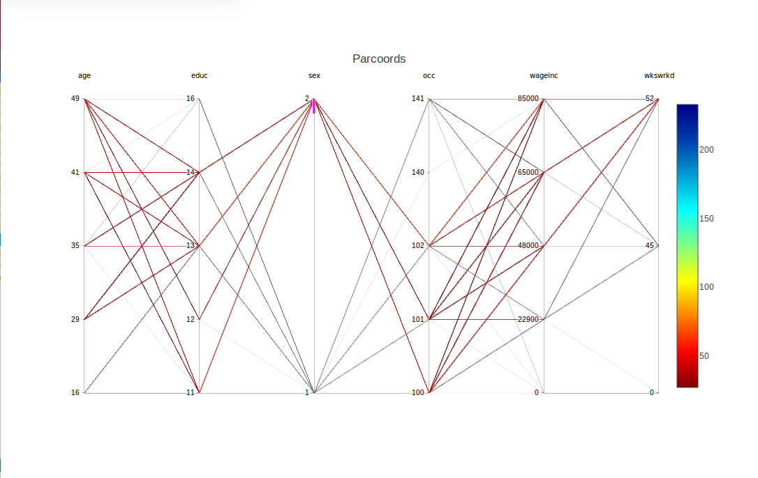
The fact that we requested brushing for sex = 2 is confirmed in the graph by the appearance of a short magenta-colored line segment just below the 2 tick mark.
Multiple columns can be brushed together. To turn off brushing, click on a non-magenta portion of the axis.
The following examples will illustrate other features of the package, as well as different applications.
Here we try the Stanford WordBank data on vocabulary acquisition in young children. The file used was English.csv, from which we have a data frame wb, consisting of about 5500 rows. (There are many NA values, though, and only about 2800 complete cases.) Variables are age, birth order, sex, mother’s education and vocabulary size.
wb <- wb[,c(2,5,7,8,10)]
wb <- discretize(wb,nlevels=5)
discparcoord(wb,k=100,saveCounts=FALSE)
We again asked for 5 levels for each variable. As noted in the Tips section below, though, cdparcoord, like any graphical exploratory tool, is best used by trying a number of different parameter combinations, e.g. varying nlevels here.
This produces
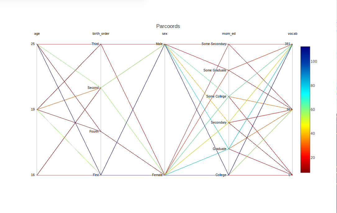
Nice – but, presuming that mom_ed has an ordinal relation with vocabulary, the ordering of the labels here is not what we would like. We can use reOrder to remedy that:
wb <- reOrder(wb,'mom_ed',
   c('Secondary','Some College','College','Some Graduate','Graduate'))
discparcoord(wb,k=100,saveCounts=FALSE)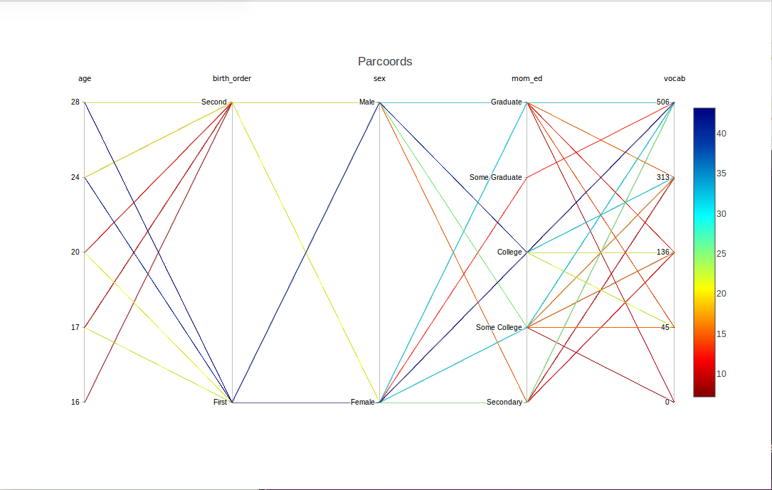
By the way, there were further levels in the mom_ed variable, ‘Primary’ and ‘Some Secondary’, but they didn’t show up here, as we plotted only the top 100 lines. (Or we set nlevels at a higher value than might be effective for this data.) There was a similar issue with missing levels on birth_order.
Speaking of the latter, the earlier-born children seem to be at an advantage, at least in the two orders that show up here.
Now suppose we wish to study girls with mothers having at least a college education. Again we can use brushing, this time with two variables sex and mom_ed together, and several values together in the latter variables:
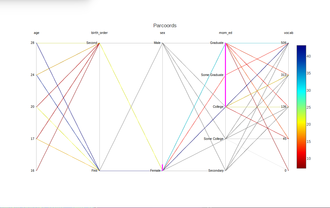
The magenta highlights show that sex and mom_ed were brushed, and in the latter case, specifically the levels ‘College’, ‘Some Graduate’ and ‘Graduate’. Lines with all other combinations now appear in light gray.
We return to the baseball, and show a more advanced usage of discretize(). The dataset is probably too small to discretize – some frequencies of interesting tuples will be very small – but it is a good example of usage of lists in discretize().
The key argument is input, which will be an R list of lists. In the outer list, there will be one inner list for each variable to be specified for discretization.
inp1 <- list("name" = "Height",
             "partitions"=3,
             "labels"=c("short", "med", "tall"))
inp2 <- list("name" = "Weight",
             "partitions"=3,
             "labels"=c("light", "med", "heavy"))
inp3 <- list("name" = "Age",
             "partitions"=2,
             "labels"=c("young", "old"))
discreteinput <- list(inp1, inp2, inp3)
discretizedmlb <- discretize(m, discreteinput)
discparcoord(discretizedmlb, name="MLB", k=100,saveCounts=FALSE)
Had we wanted to handle Height separately, we could have called discretize() twice:
inpt <- list(inp2,inp3)
m1 <- discretize(m,inpt)
m2 <- discretize(m1)
discparcoord(m2,k=150,saveCounts=FALSE) As with freqparcoord for the continuous-variable case, cdparcoord may be used for identifying outliers. This is accomplished by setting a negative value for the argument k in discparcoord(). Here we took k = -10, i.e. asked to plot the 10 LEAST frequent tuples:
data(PimaIndiansDiabetes)
pima <- PimaIndiansDiabetes
discparcoord(pima,k=-10,saveCounts=FALSE)
showCounts() 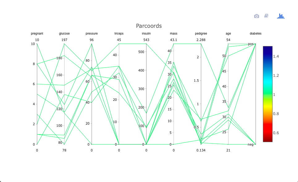
There is an interesting case of a woman who has high values on almost all the risk factors, and does indeed have diabetes. That one may be a correct data point (though possibly a candidate for exclusion in formal statistical analysis), but the case in which Thick, Insul and BMI are all 0s is clearly an error.
Let’s investigate this further, by examining the actual tuples:
> showCounts()
   pregnant glucose pressure triceps insulin mass pedigree age diabetes freq
1         6     148       72      35       0 33.6    0.627  50      pos    1
2         1      85       66      29       0 26.6    0.351  31      neg    1
3         8     183       64       0       0 23.3    0.672  32      pos    1
4         1      89       66      23      94 28.1    0.167  21      neg    1
5         0     137       40      35     168 43.1    2.288  33      pos    1
6         5     116       74       0       0 25.6    0.201  30      neg    1
7         3      78       50      32      88 31.0    0.248  26      pos    1
8        10     115        0       0       0 35.3    0.134  29      neg    1
9         2     197       70      45     543 30.5    0.158  53      pos    1
10        8     125       96       0       0  0.0    0.232  54      pos    1
So, in addition to the triple-0 case, there are several with double
0s and one with a single 0. There are probably more in the rest of the
data.
We see that there is serious need for data cleaning here.
Consider the ozone data in the UCI Machine Learning Data Repository. We will use the file onehr.data, which gives hourly readings of ozone and other values over the coure of a day. There is one row per day, during the time period 1998-2004.
The missing values are coded as question marks in the dataset, so we’ll remove any case with such a value. Also, to make the display easier to view, we’ll look only a readings every four hours. We will also include the midday temperature:
oz <-
   read.csv('https://archive.ics.uci.edu/ml/machine-learning-databases/ozone/onehr.data',header=FALSE)
noq <- function(rw) !any(rw == '?')
goodrows <- apply(oz,1,noq)
ozc <- oz[goodrows,]
for(i in 1:74) ozc[,i] <- as.numeric(as.character(ozc[,i]))
ozc4 <- ozc[,c(seq(2,25,4),39)]
ozc4d <- discretize(ozc4,nlevels=3)
discparcoord(ozc4d,k=25,saveCounts=FALSE)
The result is

Apparently on hot days, a high ozone level at the start of a day will persist as the day goes on. However, on cooler days, there may be some oscillation. As is often the case, we would need a domain expert to interpret this, but the point is that we have discovered something for him/her to investigate.
The package can be used in an exploratory manner for feature selection in classification problems. This can be useful, for instance, for identifying sets of good predictors.
Let’s look at the Letter Recognition dataset from the UCI Machine Learning Repository. Images were generated for the 26 capital letters in English, various fonts, some randomly-generated distortion. Various physical and statistical numerics were recorded for each image.
One might expect the letters O and Q to be more difficult to tell apart. Let’s view that using cdparcoord. By the way, no need to discretize here, as all values are integers.
ltr <-
read.csv('https://archive.ics.uci.edu/ml/machine-learning-databases/letter-recognition/letter-recognition.data',
   header=FALSE)
oq <- ltr[ltr[,1]=='O' | ltr[,1]=='Q',]
discparcoord(oq,k=100,saveCounts=FALSE) 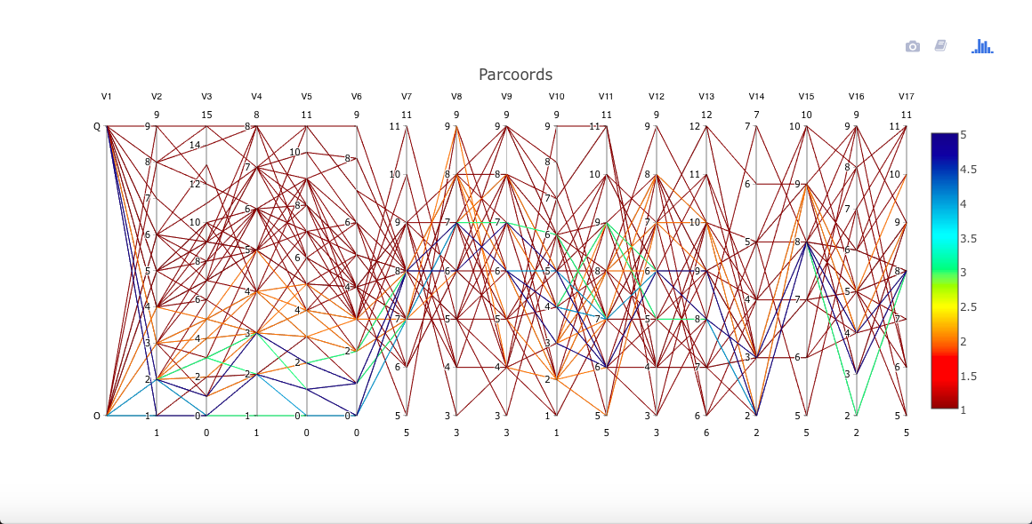
A little daunting! Yet even for these two similar letters, it appears for instance that variables V2 through V6 may have some predictive power to distinguish between the two letters. Brushing the Q node makes this a little clearer (not shown here).
Since (for positive k) we only display the most-frequent tuples, we may missing small but important subgroups. This may especially be a problem in classification applications, with one or more small classes.
For that reason, cdparcoord provides a mechanism with which the user can specify that a given subgroup be given extra weighting in the frequency counting.
Let’s use the Census data to illustrate this. If in the previous graph above for this dataset one brushes both educ = 16 and sex = 2, i.e. female PhDs, one finds that all lines are gray! There were actually 102 people of that type in the data, but that wasn’t popular enough to make the cut.
Instead, one can run
discparcoord(pe25disc,k=150,
   accentuate='with(pe25disc,educ==16 & sex==2)',saveCounts=FALSE)
which specifies to give extra weight (default value 100) to this group.
Finally, let’s look at the the Diamonds example bundled with the ggplot2 package (in turn bundled by plotly, which is loaded by cdparcoord). We’ll borrow from a Luke Tierney course example, which uses the lattice graphics library.
First, the data prep. The example “thins out” the data by taking a subsample:
library(lattice)
ds <- diamonds[sample(nrow(diamonds), 5000),]
parallelplot(~ds, group = cut, data = ds, horizontal.axis = FALSE,
             auto.key = TRUE)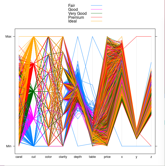
It’s a pretty picture, all right, but hard to follow, say for the Premium diamonds.
Let’s try cdparcoord, using the full data set of course, though as usual only the most-frequent tuples:
dd <- discretize(diamonds,nlevels=4)
discparcoord(dd,k=2500,saveCounts=FALSE) 
It is definitely easier to discern the patterns here than above. Look for instance at the blue lines for the Premium quality.
discparcoord()The main function is discparcoord(), which may
optionally be used with discretize().
discparcoord() accounts for partial values and drawing.
discretize()discparcoord() may optionally be used with
discretize().
discretize takes a dataset and a list of lists. It
discretizes the dataset’s values such that plot() may chart
categorical variables. The inner list should contain the following
variables: int partitions,
string vector labels, vector lower bounds,
vector upper bounds. The last three are optional.
discparcoord() detailsEncompassed in discparcoord, we provide 3 key
functions – tupleFreqs() grpcategory(), and
interactivedraw().
The call tupleFreqs(dataset,n) inputs a dataset and
returns a new dataset consisting of the n most frequent
patterns with an added column - the frequency of each column. This
dataset contains no NA values, as all of the columns previously with NA
values have now been eliminated.
By default, tupleFreqs returns the 5 most significant
tuples.
The grpcategory option allows you to create multiple
plots, one for each category. If a field has 4 possible values, then
discparcoord() with the grpcategory option
will create a plot for each category, where each plot has the specific
category’s attributes.
For example, if a field “Weight”has “Heavyweight” and “Lightweight”, then this will create one plot where all tuples are heavyweights, then one more where where all tuples are lightweights.
interactivedraw() takes a dataset and draws a
parallel coordinates plot that opens in your browser. It has movable
columns, brushing, and the ability to save your plots. You can also
choose to toggle labels on and off. For more information, type
?interactivedraw into the console.
Like any exploratory graphical tool, cdparcoord is best used by trying various parameter values, e.g. different values of k, nlevels and so on, one then just one combination of settings..
Pay close attention to the frequency color-coding. For instance, if the lines are all green, this means the frequencies are all about the same, likely 1. In such case, you may wish to use discretize() with a small value of nlevels.
On the other hand, there are situations in which one may not wish to discretize, such as:
When searching for outliers (negative k), the cases of interest will typically have frequency 1 and in any event the frequency may not be of interest here.
With a large number of variables, even a value of 2 for nlevels will result in frequencies of 1, so it may be better not to discretize in the first place. Actually, freqparcoord may be more useful here.
Sometimes labels greatly hinder the visibility and clarity of the plot. This can be circumvented by opting to remove labels in plot.
Sometimes two lines will coincide in one or more segments. Brushing may help separate them.
(EXPERIMENTAL, MAY BE VERY SLOW)
R and R packages typically leave out any rows with NA values.
Unfortunately for data sets with high NA counts, this may have drastic
effects, such as low counts and possible bias. cdparcoord
addresses this issue by allowing these rows to partially contribute to
overall counts. See the NAexp variable in
tupleFreqs().
Norm Matloff, Vincent Yang, Harrison Nguyen